Preview image. Unlock full-res
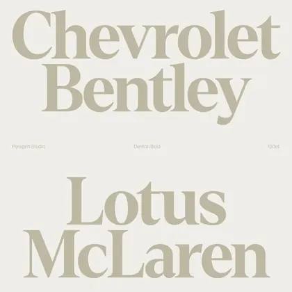
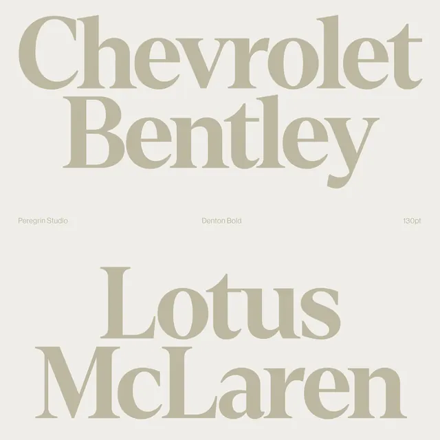
A typographic layout showcasing the names of four prominent automotive brands in a cohesive, large-scale arrangement.
Summary
A typographic layout showcasing the names of four prominent automotive brands in a cohesive, large-scale arrangement.
Visual description
The image features four brand names—Chevrolet, Bentley, Lotus, and McLaren—stacked vertically in a large, elegant serif typeface. The text is rendered in a muted taupe color against a light off-white background with small, faint subtext labels.
Key takeaway
Demonstrates how high-contrast serif typography can create a premium, unified aesthetic across different brand identities.
Reuse notes
Use as a reference for high-end editorial layouts or luxury brand typography pairings.
More like this



Keep what you find
A free account saves references to boards and can send you a weekly email of picks based on what you save.
To see every result, go Pro.