Preview image. Unlock full-res
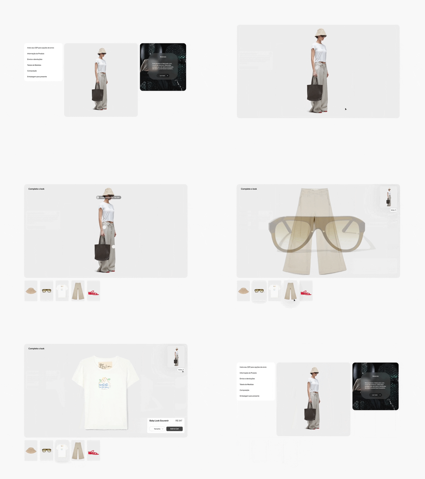
Three-panel product page layout with neutral palette, left navigation, centered model showcase, and right-side materials info card.
Summary
Three-panel product page layout with neutral palette, left navigation, centered model showcase, and right-side materials info card.
Visual description
A structured three-column interface showing a fashion product page. The left panel contains a vertical navigation menu with Portuguese text labels (Envios, Informação do Produto, Envios e devoluções, Tabela de Medidas, Composição, Embalagem para presentear). The center panel displays a model in full-length profile wearing a cream sleeveless tank top and beige linen trousers, holding a dark charcoal tote bag against a light gray background. The right panel contains a dark rounded-corner card titled "Materiais" with white body text describing product composition and a small arrow link. The overall palette is warm and muted: off-white, beige, charcoal, and gray with careful spacing and typography hierarchy.
Key takeaway
The tripartite layout distributes information density evenly across the viewport, preventing cognitive overload. Using a dark content card on a light ground creates visual hierarchy and containers related information. Centering the product photo with breathing room on all sides allows the item to feel substantial without feeling cramped.
Reuse notes
Effective for fashion e-commerce with apparel or accessories where material information and sizing are purchase factors. The dark card pattern works well for sustainability/material callouts. Use centered product photography when the item's silhouette is the selling point. Not ideal if multiple SKU variants need to be shown simultaneously.
More like this
Keep what you find
A free account saves references to boards and can send you a weekly email of picks based on what you save.
To see every result, go Pro.