Preview image. Unlock full-res
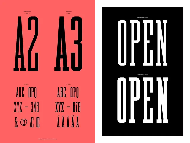
A side-by-side comparison of two different typefaces, A2 and A3, showcasing their distinct weights, proportions, and character sets.
Summary
A side-by-side comparison of two different typefaces, A2 and A3, showcasing their distinct weights, proportions, and character sets.
Visual description
The image features two vertical panels. The left panel is coral pink with black text showing 'A2' and 'A3' with character sets. The right panel is black with white text showing 'OPEN' in two different weights.
Key takeaway
The design highlights the contrast between a heavy, condensed display face and a more structured, geometric sans-serif.
Reuse notes
Use as a reference for selecting high-impact display fonts for headlines.
More like this
Keep what you find
A free account saves references to boards and can send you a weekly email of picks based on what you save.
To see every result, go Pro.