Preview image. Unlock full-res
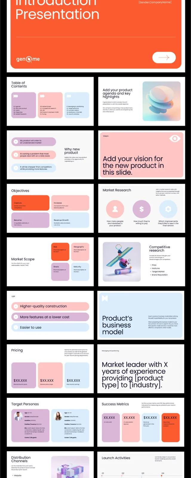
A multi-slide product launch presentation template featuring a vibrant orange headline slide, pastel card layouts, and a cohesive system of accent colors and geometric shapes for organizing content.
Summary
A comprehensive slide-deck template system showcasing 12+ layouts for product launch pitches, anchored by a bold orange headline slide and filled with soft-pink, lavender, and blue card blocks for modular content (features, market research, pricing, team, metrics).
Visual description
Vertical slide stack on black background. Cover slide: large white uppercase "New Product Introduction Presentation" headline on vibrant orange field with "Powered by" tagline top-right, small genOme logo bottom-left. Interior slides follow: white backgrounds with color-blocked content cards in soft pastels (rose, lavender, sky blue) arranged in 2x2 or 3-column grids. Slide types visible include: table-of-contents (three color cards with text), feature overview (orange box + pink cards), market research (pink header, blue/lavender cards), objectives (orange/lavender split), team (avatar circles in color blocks), pricing (three columns), market leadership (photo + text pairing), business model (pastel blocks), launch activities (colored boxes with icons/labels). All text is sans-serif; geometric shapes (rectangles, circles) separate content without borders.
Key takeaway
Restricting the palette to one vibrant primary (orange), one bright secondary (soft pink), and two cool accents (lavender, sky blue) creates visual unity across many slides. Using color blocks as content containers (not decorative backgrounds) makes slide layouts feel modular and scannable. The 2x2 grid pattern repeats across many layouts, reducing cognitive load. Opening with an all-caps bold headline + solid background signals confidence.
Reuse notes
Excellent starting point for B2B product pitch or feature-comparison decks. The pastel + vibrant split works when you need both energy (orange, hero) and approachability (pastels, details). Scale this pattern: one primary color for the headline/hero moment, two pastels for content sections, one neutral for body text. Works well for internal roadmap presentations and investor pitches.
More like this



Keep what you find
A free account saves references to boards and can send you a weekly email of picks based on what you save.
To see every result, go Pro.