Preview image. Unlock full-res
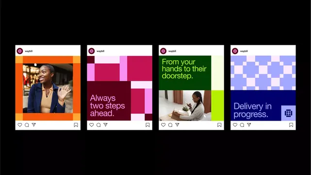
A set of four Instagram-style cards for a logistics brand using vibrant color blocking, bold sans-serif headlines, and distinct geometric patterns to communicate delivery stages.
Summary
Four card-format social posts for Waybill delivery service, each using a distinct color block, geometric pattern, and short service-focused headline to convey stages of delivery.
Visual description
Four identically sized white rectangular cards on a black background, each with a Waybill logo (magenta circle) at the top. Card 1: warm orange background with a portrait photo of a woman in a blue jacket, white text action below. Card 2: magenta and burgundy asymmetric color blocks forming an abstract composition, with white serif text stating "Always two steps ahead." Card 3: deep green block on top, white block on bottom, yellow-green headline text reading "From your hands to their doorstep," with a supporting photograph of a woman packing a cardboard box. Card 4: periwinkle and navy blue checkerboard pattern filling the upper half, with dark blue section below containing pale lavender headline "Delivery in progress." and a small icon. Each card includes a consistent footer with interaction icons (heart, message, save, bookmark) mimicking Instagram UI.
Key takeaway
Asymmetric geometric color-blocking that feels playful and modern while remaining professional and on-brand. Photo placement layered over solid color creates visual hierarchy and breaks monotony. Short, benefit-driven headlines paired with supporting imagery that shows the service in action. The checkerboard pattern adds visual interest without becoming chaotic.
Reuse notes
Well-suited for logistics, delivery, or e-commerce brands that want to appear modern and trustworthy without being corporate. Each card works independently but reads cohesively as a series. The approach balances personality (color, geometry) with clarity (large text, clear messaging). Best used in feed format or carousel to show the full narrative arc of the service.
More like this




Keep what you find
A free account saves references to boards and can send you a weekly email of picks based on what you save.
To see every result, go Pro.