Preview image. Unlock full-res
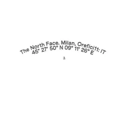
Type composition with curved sans-serif text following a circular path, overlaid with latitude and longitude coordinates, anchored by a single point marker.
Summary
Geometric type specimen where text follows a circular curve, integrating geographic coordinates as a design element to suggest place and precision.
Visual description
Light gray sans-serif text curves concentrically around a circular path on a white background. The outer curve reads "The North Face Milan Orfeijt" with latitude and longitude coordinates integrated as "45° 27' 50"N 09° 11' 26"E". A small centered dot below the curved text anchors the composition. The overall effect is centered, radial, and austere: typography as location marker.
Key takeaway
The elegant fusion of practical data (coordinates) with typography: the curve itself becomes a visual argument for place. The restraint works: no color, no embellishment, just precise letterforms and numbers. Useful for brands or studios wanting to signal location, rigor, or geographic focus.
Reuse notes
Works well for architectural practices, travel brands, or studios built around a specific place. The minimalist aesthetic suits corporate identity and editorial applications. The circular composition can anchor layouts or appear as a mark. Beware of text readability at small scales due to the curve.
More like this

Keep what you find
A free account saves references to boards and can send you a weekly email of picks based on what you save.
To see every result, go Pro.