Preview image. Unlock full-res
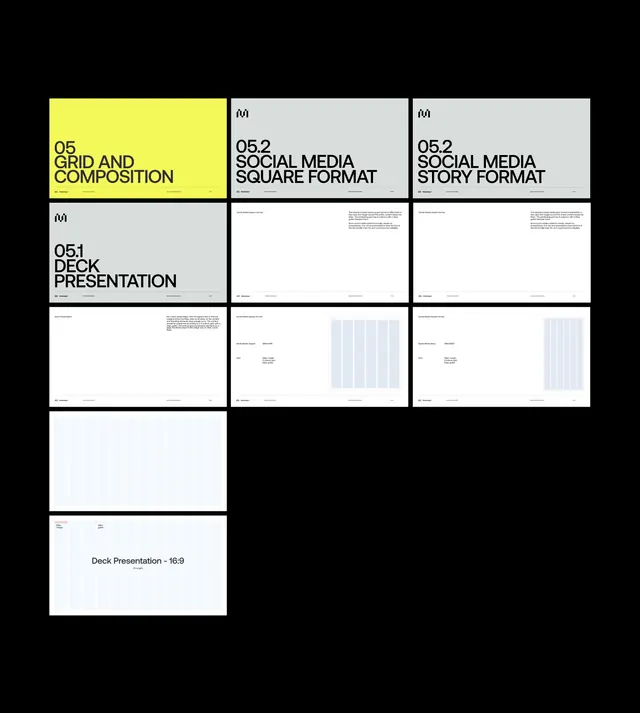
Typographic layout showcasing design system components arranged in a grid with a single bright yellow callout panel drawing focus to key section.
Summary
A typographic design system layout using a grid structure with a single bright yellow panel to emphasize the primary section heading.
Visual description
A nine-panel grid composition against a black background. The top-left panel is bright neon yellow with black all-caps sans-serif type reading "05 GRID AND COMPOSITION." All other eight panels have neutral light grey backgrounds with black text; they show section titles ("05.1 DECK PRESENTATION," "05.2 SOCIAL MEDIA SQUARE FORMAT," "05.2 SOCIAL MEDIA STORY FORMAT") and below each, fine-print body copy and abstract placeholder content (bars, lines, or whitespace). The layout is strictly aligned, with even spacing between panels. No imagery, only type and geometric shapes. The contrast between the single hot yellow panel and the grey-and-white majority creates immediate visual hierarchy and forces focus to the primary topic.
Key takeaway
Using a single high-saturation color to anchor one panel in a monochrome grid is a foolproof way to guide the eye and establish priority. The all-caps, sans-serif type choice keeps the system minimal and legible at any scale. Consistent panel sizing and typography weight variance (large headings, small body) create a clear reading order without decorative elements.
Reuse notes
Ideal for design system documentation, product guides, or component catalogues where you need to present multiple options side-by-side. The yellow-on-grey technique works best on digital displays and print where color fidelity is controlled. Could adapt to any primary brand color in place of yellow.
More like this
Keep what you find
A free account saves references to boards and can send you a weekly email of picks based on what you save.
To see every result, go Pro.