Preview image. Unlock full-res
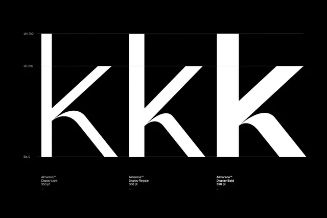
A typographic exploration of the letter 'K' presented in three distinct weights and styles.
Summary
A typographic exploration of the letter 'K' presented in three distinct weights and styles.
Visual description
Three large white 'K' characters are arranged horizontally against a solid black background. Each letter features different stroke weights and geometric proportions, with technical labels and measurements positioned above and below them.
Key takeaway
The design demonstrates how varying stroke weight and geometric construction can alter the visual weight of a single character.
Reuse notes
Use as a reference for custom lettering, logo construction, or high-contrast typographic layouts.
More like this

Keep what you find
A free account saves references to boards and can send you a weekly email of picks based on what you save.
To see every result, go Pro.