Preview image. Unlock full-res
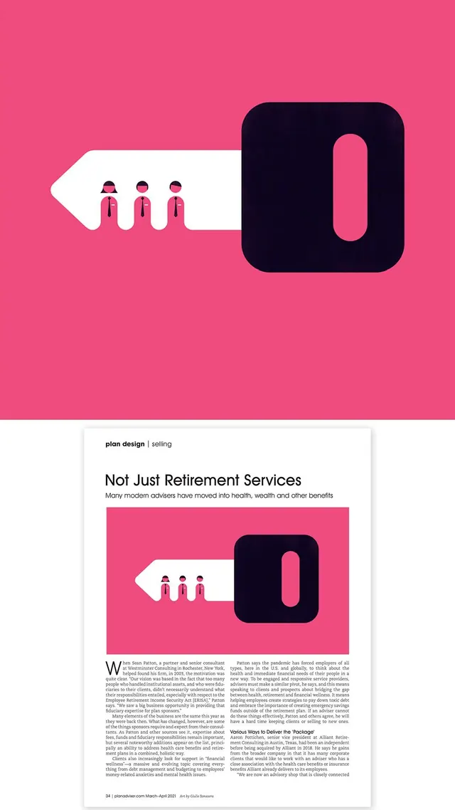
Magazine spread with bold pink background, minimalist black-and-white vector icon of three people and a rounded-square form, paired with serif body copy about retirement advisory services.
Summary
Magazine spread with bold pink background, minimalist black-and-white vector icon of three people and a rounded-square form, paired with serif body copy about retirement advisory services.
Visual description
Two-tier layout: upper half is a saturated hot-pink field with a stark black rounded-square containing a white pill-shaped void (representing an open form or entry point), adjacent white arrow shape housing three simplified human figures in solid dark and pink accent. Lower half is white background with serif headline 'Not Just Retirement Services,' subheading line, a repeated version of the icon graphic set, and dense body text in serif typeface explaining advisory services. Clean grid structure, minimal ornamentation, strong positive-negative contrast throughout.
Key takeaway
The geometric abstraction of people and process into nearly-iconic forms. The pink-and-black color lock is bold without being garish, and the rounded square containing negative space reads as both a portal and a container, suggesting transformation or entry. The split between illustrative upper half and text-heavy lower half works because the graphic is self-explanatory and doesn't compete with the narrative.
Reuse notes
Strong fit for fintech, insurance, and wealth-management editorial and advertising. The high saturation pink works best with strong sunlight or on-screen viewing; in dimly lit contexts or print, it may read as purple. The icon set is simple enough to adapt to other service verticals (health care, legal services, HR platforms) by swapping the human figures and form context.