Preview image. Unlock full-res
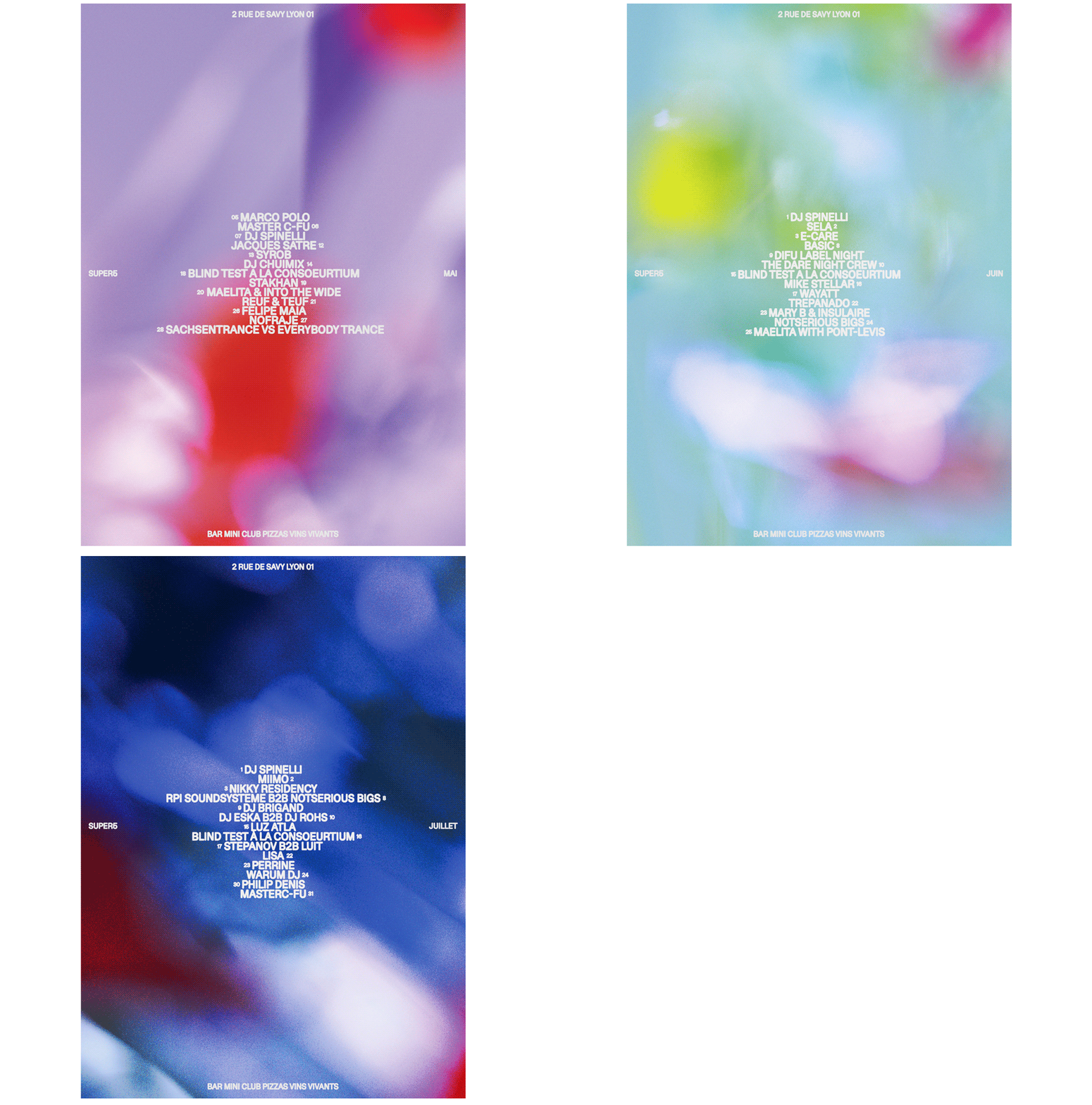
An electronic music festival poster overlaying hierarchical artist lineups on an immersive blurred purple-to-red gradient background.
Summary
An electronic music festival poster layering hierarchical DJ and artist names over a blurred gradient that shifts from soft lavender-purple to hot pink and deep red.
Visual description
Full-bleed composition with blurred, out-of-focus gradients dominating the background, creating depth through color movement (purple dominant in upper left and right edges, hot pink and deep red concentrated in the center and bottom). Artist lineups and event details rendered in clean white all-caps sans-serif, arranged in a loose vertical center column. Venue address "2 RUE DE SAVY LYON 01" floats top-center in small type. Artist names distributed at varying scales with numbered date callouts (06, 08, etc.). Bottom-right corner features event details "BAR MINI CLUB PIZZAS VINS VIVANTS" in white type. The blurred background creates an immersive, dreamy quality while maintaining readable typography contrast.
Key takeaway
The blurred-gradient approach: it's energetic and modern without requiring sharp imagery. The layered transparency of type over motion creates depth and movement. Using white all-caps type with numeric callouts organizes complex information (many artists) without feeling cluttered. The color shift from cool to warm (purple > pink > red) creates visual momentum that pulls the eye downward naturally.
Reuse notes
Ideal for music events, nightlife promotion, or high-energy brand campaigns. The blurred aesthetic suggests motion and excitement; works well at small sizes (Instagram, TikTok) because the typography remains crisp even when the background blurs. Avoid placing critical text over the densest color zones (here, the red center). The all-caps, numbered layout works for any event with many speakers/artists; adapt sizing based on hierarchy (headliners larger, supporting artists smaller).
More like this

Keep what you find
A free account saves references to boards and can send you a weekly email of picks based on what you save.
To see every result, go Pro.