Preview image. Unlock full-res
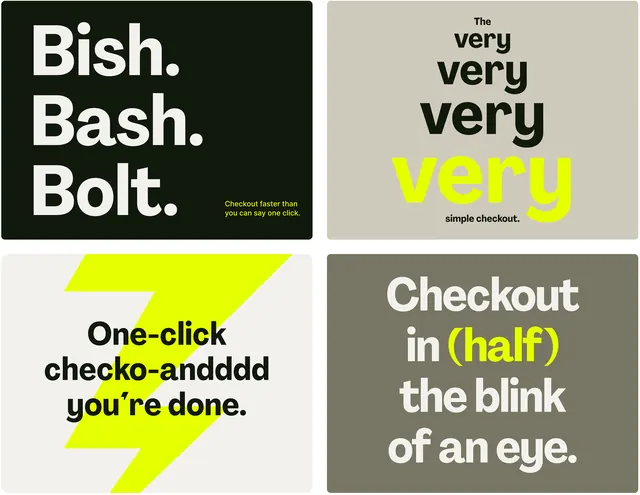
Fast-checkout messaging layout using aggressive high-contrast blocks, chunked uppercase headlines, and neon-yellow stripe accents to emphasize conversion speed and simplicity.
Summary
A fintech checkout interface using a stark 2x2 grid of monochrome panels punctuated by a neon-yellow diagonal stripe, where each block emphasizes checkout speed through chunked copy and high-contrast typographic hierarchy.
Visual description
The layout is divided into four equal quadrants, each a distinct color block with white or dark text: dark olive (top-left) holds white all-caps "Bish. Bash. Bolt." chunked across three lines, with small supporting text below; pale beige (top-right) displays "The very very very YOOOU" where "YOOOU" is lime-yellow, with small centered text (a single checkout reference); a pale gray-white background (bottom-left) is bisected by a bright neon-yellow diagonal stripe bearing "One-click checko-aridddd you're done" in black all-caps, the copy wrapping around the geometric stripe; dark warm gray (bottom-right) shows "Checkout in (HALF) the blink of an eye" with "HALF" and "eye" in lime-yellow. All typography is clean sans-serif, set in uppercase or mixed case for emphasis. The overall effect is deliberately jarring and modular, using negative space and color blocking rather than imagery.
Key takeaway
The neon stripe is a directional accent that breaks the grid without feeling random; it draws the eye while the chunked copy (sentence fragments, unexpected line breaks) reinforces urgency and speed. Each quadrant operates as a self-contained callout yet the palette unity and grid structure keep it cohesive. This is a potent formula for fintech and ecommerce conversion messaging where perceived speed and friction reduction are selling points. The brutalist simplification (no photography, no soft curves) conveys technical confidence.
Reuse notes
Perfect for fintech checkout flows, payment processors, or any ecommerce interface emphasizing speed and simplicity. The neon accent is bold and reads younger/startup-coded; pair with audiences expecting irreverent, direct tone. The 2x2 grid and color-blocking translate well to mobile and web. Avoid if you need warmth or luxury positioning, as the hard contrast and primary-color stripe feel utilitarian by design.
More like this

Keep what you find
A free account saves references to boards and can send you a weekly email of picks based on what you save.
To see every result, go Pro.