Preview image. Unlock full-res
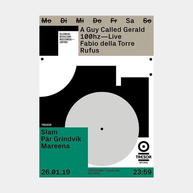
A Swiss modernist event poster for a Tresor Records showcase, combining stark geometric forms, a teal accent bar, and a monochromatic palette to announce multiple music acts in a high-impact, brutalist composition.
Summary
A Swiss modernist event poster for Tresor Records featuring a stark black and white composition anchored by a single teal bar, promoting a lineup of contemporary electronic music artists with asymmetrical geometric staging.
Visual description
The poster is divided into a light gray background with bold black geometric forms: a large black rectangle in the upper left, a curved black shape dominating the lower half, and a large off-white circle floating in the center-right. The teal green bar occupies the bottom third, containing artist names and date details (26.01.19 and 23:59 end time). The top section lists the day of the week (Mo Di Mi Do Fr Sa So) and features the Globus/Bosconi Records logo in white on black. The right side displays the primary acts (A Guy Called Gerald, 100hz, Fabio della Torre, Rufus) in a stacked sans-serif font on the gray background. The overall composition is asymmetrical with strategic white dots acting as focal points. Typography is bold, geometric, and sans-serif throughout, typical of Swiss design vocabulary from the 1990s.
Key takeaway
The use of a single accent color (teal) to punctuate an otherwise monochromatic (black/white/gray) composition, creating instant visual hierarchy without saturation. The asymmetrical balance of bold geometric shapes (rectangles, curves, circle) that feel architectural rather than ornamental. The vertical stacking of artist names in a geometric sans-serif that reads as both functional and sculptural, turning information into composition.
Reuse notes
Essential reference for music event posters, cultural institution communications, or any brutalist graphic where legibility must coexist with bold geometry. The teal acts as a call-to-action bar, making it work well for ticketed events. Works best when the typeface choices are austere and modern. The approach scales down poorly on small screens, so better suited for print, posters, and large-format displays. The monochromatic base allows photography or additional graphic elements to be layered on top if needed.
More like this



Keep what you find
A free account saves references to boards and can send you a weekly email of picks based on what you save.
To see every result, go Pro.