Preview image. Unlock full-res
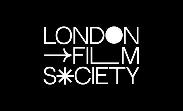
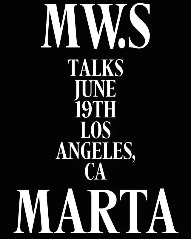
Monochromatic logo with geometric letterforms and a circular dot replacing one letter, arranged in stacked rows against black background.
Summary
Monochromatic institutional logo with clean geometric letterforms and a circular dot used as a design accent, displayed in white against a black background.
Visual description
A logo composition in white on solid black shows three lines of bold, all-caps sans-serif type. The letterforms are geometric and condensed, with consistent line weight and stroke-based construction. The middle line replaces the second letter with a solid white circle, creating visual rhythm and breaking the typographic pattern. An arrow or line extends from the first line, adding directional movement. The layout is stacked vertically and centered. The monochromatic treatment and simple geometric construction create a high-contrast, formal institutional appearance.
Key takeaway
The circle-replacing-letter technique creates a memorable focal point without adding unnecessary elements. The geometric sans-serif is authoritative and timeless. The directional arrow (extending left from the top line) adds subtle movement and suggests seeking or discovery. The stacked composition works well at multiple scales and is legible as a symbol even when reduced.
Reuse notes
Strong reference for film festivals, media organizations, or educational institutions. The monochromatic palette is reproduction-friendly and works across all media (film, print, digital). The geometric construction ensures clarity when scaled down. The circle motif can become a secondary brand mark. Avoid using on colorful backgrounds where the stark contrast might feel jarring.
More like this


Keep what you find
A free account saves references to boards and can send you a weekly email of picks based on what you save.
To see every result, go Pro.