Preview image. Unlock full-res
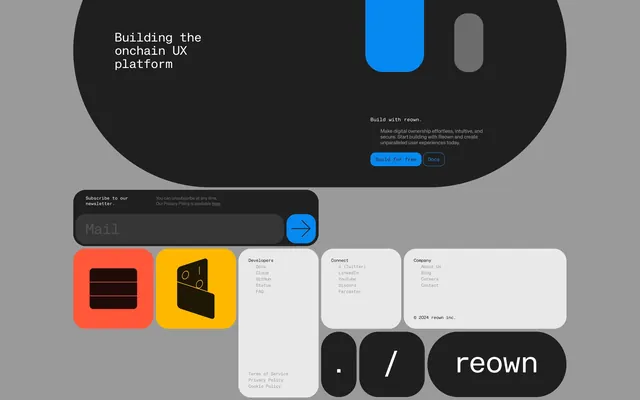
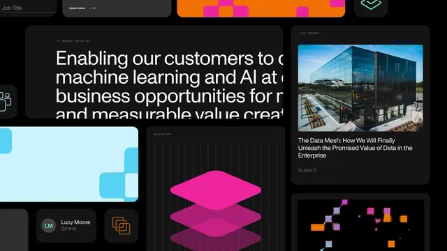
A collection of UI components and brand elements including a hero section, newsletter signup, icons, and footer elements.
Summary
A collection of UI components and brand elements including a hero section, newsletter signup, icons, and footer elements.
Visual description
The layout features high-contrast elements with rounded rectangular containers in black, white, and vibrant blue, orange, and yellow. It uses bold sans-serif typography and simple geometric icons to create a structured, modular interface. The composition is organized into distinct blocks of varying sizes against a neutral gray background.
Key takeaway
Use high-contrast, vibrant accent colors against dark or light backgrounds to create clear visual hierarchy in modular UI components.
Reuse notes
Apply this style when designing modern, developer-focused software interfaces that require a bold and technical aesthetic.
More like this
Keep what you find
A free account saves references to boards and can send you a weekly email of picks based on what you save.
To see every result, go Pro.