Preview image. Unlock full-res
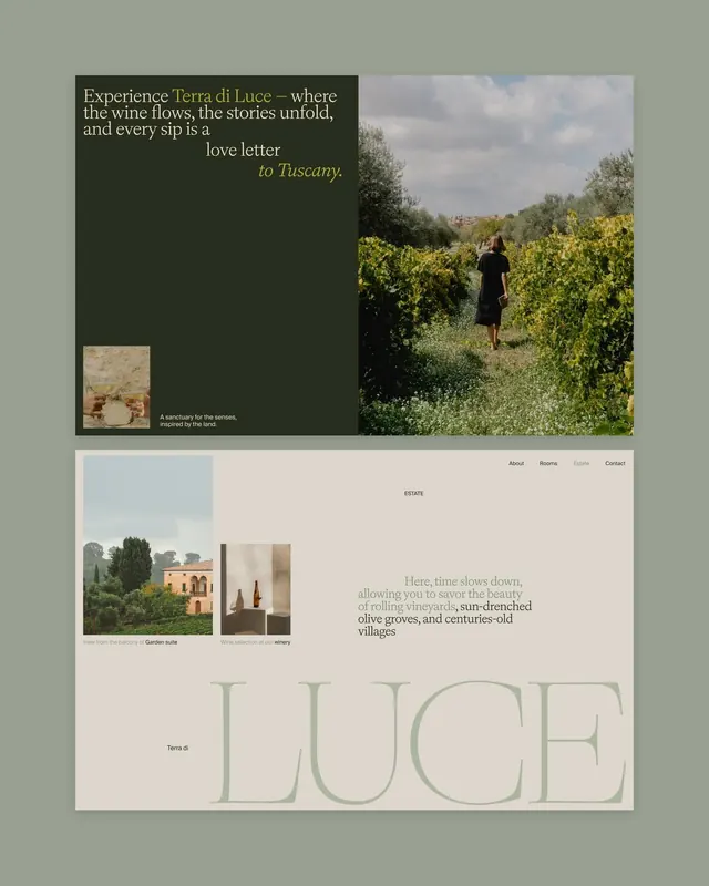
Website mockup for a Tuscan wine estate using oversized serif type with earthy sage-green and cream palette, mixing architectural photography with lifestyle imagery.
Summary
Website mockup for a Tuscan wine estate using oversized serif type with earthy sage-green and cream palette, mixing architectural photography with lifestyle imagery.
Visual description
Three stacked comps against a muted sage-green background. Top: left side holds a large serif headline and italic accent type in cream/pale text on dark sage, paired with a hero photo of vineyard rows and a woman walking (right half). A small square product image sits in the lower left corner. Middle: two-column layout with architectural building photo left and wine bottles center, flanked by left-aligned serif type reading "Estate" and multi-line descriptions. Bottom: large serif display type reading "LUCE" in pale green-gray fills the lower third, with navigation and subheading visible in pale cream type. Throughout: generous white space, strict typography hierarchy (oversized serif display paired with smaller sans-serif body), and a limited earthy palette (sage, cream, dark olive, pale green).
Key takeaway
The restraint of reducing a full palette to four earth tones (sage, cream, olive, pale green). Large serif typography handling both brand voice and spatial composition. Asymmetric stacking of photography with text creates editorial rhythm without complexity.
Reuse notes
Ideal for wine, hospitality, luxury goods, or farm-to-table brands where heritage and landscape matter. The serif-and-cream-on-sage pairing is distinctly warm and approachable yet premium. Works best with strong, well-composed photography. Pair with substantial line-heights and breathing room between sections.
More like this
Keep what you find
A free account saves references to boards and can send you a weekly email of picks based on what you save.
To see every result, go Pro.