Preview image. Unlock full-res
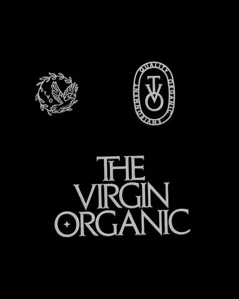
Centered display of serif wordmark with two organic-form emblems on a pure black ground, emphasizing premium purity through monochromatic restraint.
Summary
A monochromatic brand identity study showing "THE VIRGIN ORGANIC" in large serif letters centered beneath two emblems: a naturalistic organic form on the left and a circular badge with serif monogram on the right, all on black.
Visual description
Pure black background. Upper portion displays two emblems in white: left emblem is an intricate organic/floral mark with flowing lines suggesting natural forms; right emblem is a circular seal with "VM" monogram in serif caps surrounded by a text ring (mostly illegible at this scale). Center-lower: large serif display type spelling "THE VIRGIN ORGANIC" in all caps, letter-spaced, with balanced weight and refinement suggesting both natural origin and premium craftsmanship.
Key takeaway
The contrast strategy: pure black ground makes white typography and emblems read with absolute clarity; the pairing of a loose organic mark with a formal circular seal creates duality (natural/refined); centered stacked composition with horizontal breathing room between emblem row and type.
Reuse notes
Strong foundation for premium natural-product branding (skincare, organic food, wellness). The black background limits versatility but reads luxe and certain. The serif wordmark conveys heritage and purity; works across packaging, labels, and digital.
More like this





Keep what you find
A free account saves references to boards and can send you a weekly email of picks based on what you save.
To see every result, go Pro.