Preview image. Unlock full-res
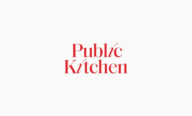
Minimal wordmark in red serif italic type on cream background, emphasizing elegance through restraint.
Summary
A two-word logotype set in red serif italic capitals, paired with a cream background to signal culinary warmth and approachability.
Visual description
"Public Kitchen" rendered in a flowing italic serif typeface occupies the center of a soft cream field. The words stack vertically with generous spacing. The red hue is saturated and warm, creating a refined contrast against the pale ground. The italic slant adds movement and personality to the letterforms without sacrificing legibility. Minimal and centered, the layout lets the typography speak entirely.
Key takeaway
The discipline of a two-color palette (red plus cream) and the way italic serif can convey both formality and hospitality. The breathing room around the wordmark amplifies its impact.
Reuse notes
Ideal for food, beverage, or lifestyle brands seeking elegant simplicity. Red italic serifs work particularly well for establishments emphasizing tradition or culinary craft. The cream background communicates warmth; pair with light textures or subtle patterns in secondary applications.
More like this



Keep what you find
A free account saves references to boards and can send you a weekly email of picks based on what you save.
To see every result, go Pro.