Preview image. Unlock full-res
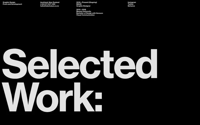
Black and white designer portfolio with bold typography, location/contact info at top, and large "Selected Work" heading dominating the lower half.
Summary
Black and white designer portfolio card with stark typography hierarchy, Auckland location line at top, and oversized "Selected Work:" heading claiming the lower two-thirds.
Visual description
Horizontal composition on solid black background. Upper left quadrant: stacked text blocks listing "Graphic Design / Front-end Development" (job title), contact phone and email (Auckland, New Zealand), social links (Instagram, Twitter, Behance). Upper right: education timeline (2015-2018 Massey University, Bachelor of Design with Honours, Visual Communication). Center and bottom: "Selected Work:" as massive white sans-serif headline in a geometric, display-weight font with generous letterspacing and stroke weight. The layout uses pure white on black with zero color, strict grid-based alignment, and breathing room between text clusters.
Key takeaway
The severity of the type scale contrast: a small, elegant information hierarchy giving way to one dominating statement. The use of pure black/white with no gray midtones reinforces hierarchy. Text blocks are left-aligned and vertically stacked, letting whitespace and scale do the heavy lifting.
Reuse notes
Strong for designer portfolios, CVs, or any case where a single focal concept needs to announce itself. The layout assumes the "Selected Work" section continues below, so it works best when followed by portfolio grid or case study content. Works only on dark backgrounds.
More like this


Keep what you find
A free account saves references to boards and can send you a weekly email of picks based on what you save.
To see every result, go Pro.