Preview image. Unlock full-res
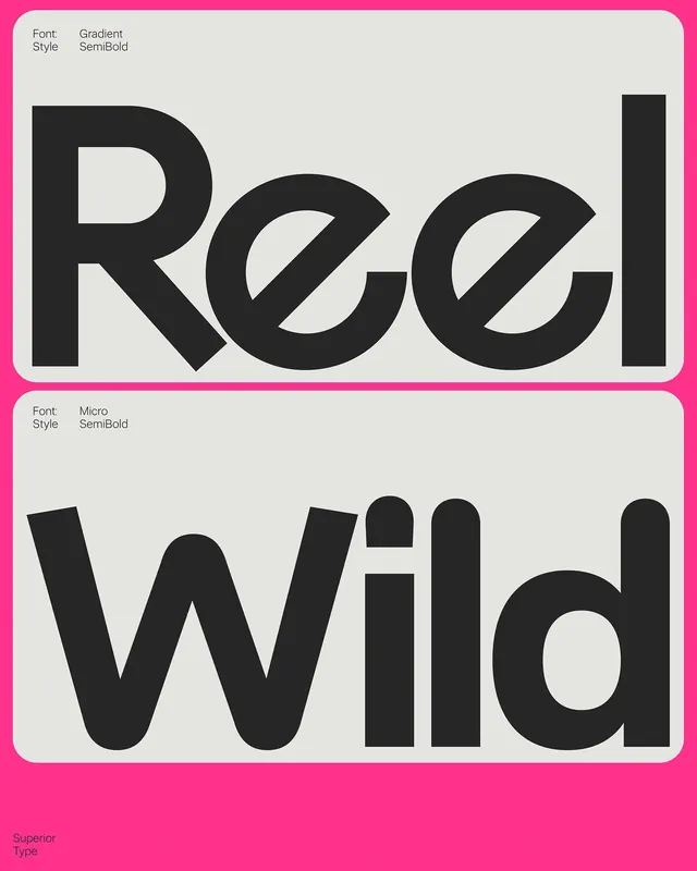
A bright magenta type specimen poster showing Gradient and Micro semibold styles in stacked grey panels.

Summary
Two rounded light-grey cards on a neon pink field showcase large black words set in different Superior Type families with small style labels.
Visual description
The top panel displays the word Reel in a geometric sans with slanted terminals and high x-height, labeled Font Gradient and Style SemiBold in tiny black type at the upper left. The lower panel shows Wild in a softer rounded sans with overlapping V shapes on the W, labeled Font Micro and Style SemiBold. Superior Type appears in small lettering at the bottom left of the full poster. The background is solid hot pink with high contrast between the grey cards and black letterforms.
Key takeaway
Stacked specimen cards on a loud solid ground make type comparison feel graphic and retail-ready without specimen tables or paragraph text.
Reuse notes
Reference for foundry marketing, social type drops, and pairing one neon brand color with neutral panels. Works when two distinct styles need side-by-side contrast at display size.
More like this



Keep what you find
A free account saves references to boards and can send you a weekly email of picks based on what you save.
To see every result, go Pro.