Preview image. Unlock full-res
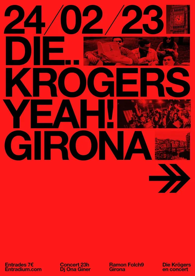
Concert poster for Die Krogers with bold black sans-serif type set large against a bright-red field, punctuated by cropped black-and-white band photographs.
Summary
Concert poster for Die Krogers featuring massive black sans-serif type stacked vertically across a bright-red field, with three cropped black-and-white band photographs providing visual punctuation and documentary reference.
Visual description
Bright-red rectangular poster in portrait orientation. The left and upper areas are dominated by the band name "DIE KROGERS" rendered in heavy all-caps sans-serif type in pure black, sized to fill nearly half the poster. The date "24/02/23" appears in the same typeface in the top-left corner, much smaller. Three cropped black-and-white photographs of the band are positioned within the text block and to the right: tight framing of band members in performance mode, desaturated to create stark contrast against the red. Below the main type is a horizontal black line with a double-arrow mark pointing right, a directional accent. The bottom footer lists venue and ticket information in small black type. The overall composition is confident and assertive, trusting the scale of the type and the shock of the red.
Key takeaway
The restraint of a two-color palette (red and black) applied with maximum confidence and scale. The photographs serve as evidence and energy, not decoration. The grid-like placement of photos within the text block keeps the poster legible while adding texture. The oversized type dominates the viewer's eye and makes the band name impossible to miss.
Reuse notes
Strong template for music and performance posters, especially rock, punk, or edgy genres where boldness is expected. The two-color solution is economical and prints cleanly. The photograph strategy works well when you have authentic band imagery; without strong reference photos, the design loses energy. Dates and venue info should be easy to update; keep the type size hierarchy locked.
More like this



Keep what you find
A free account saves references to boards and can send you a weekly email of picks based on what you save.
To see every result, go Pro.