Preview image. Unlock full-res
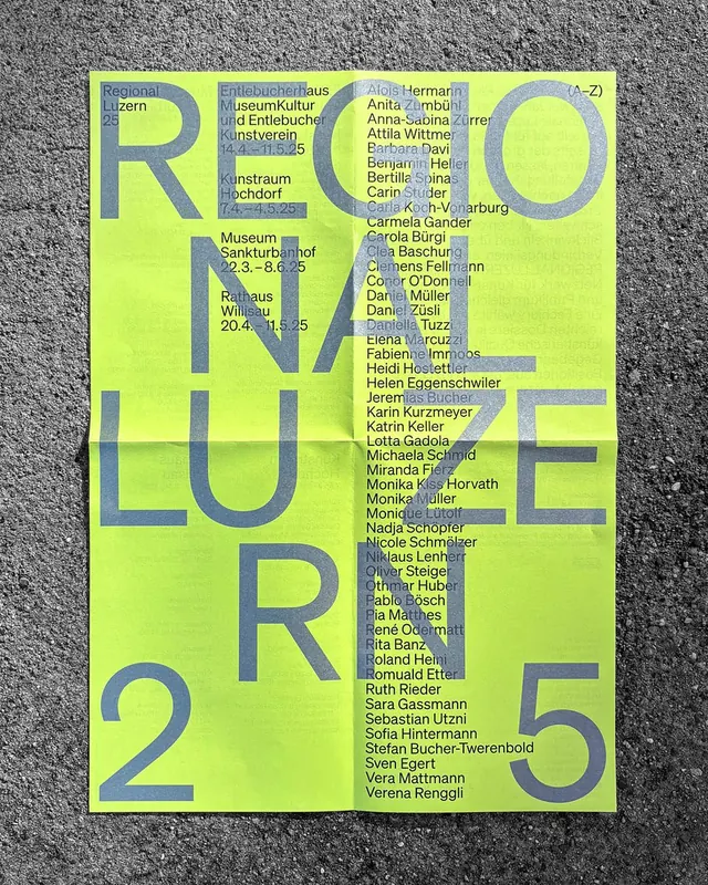
Exhibition poster using bold typographic hierarchy with large geometric letterforms and embedded directory of participant names on yellow-green background.
Summary
Exhibition poster using bold typographic hierarchy with large geometric letterforms and embedded directory of participant names on yellow-green background.
Visual description
Bright lime-yellow background with large sans-serif letterforms spelling "REGIONALE 25" in gray-blue, arranged as a visual focal point. The composition is densely typeset with a directory of names in small sans-serif text overlaid across all the large letters, creating a layered, textured effect. Gray and blue-gray tones create contrast against the saturated lime background. The grid of names functions both as documentation and as a compositional pattern, with precise left-aligned columns filling the entire poster space.
Key takeaway
The aggressive use of typography at conflicting scales (massive headline letters with tiny text-weight names) creates visual tension and legibility without needing imagery. The single, saturated background color lets the type-on-type layering read clearly. Directory listings can be a design element, not just information.
Reuse notes
Works for event posters, exhibition catalogs, and award listings where acknowledging many names is mandatory. Requires a genuinely bold typeface and high contrast between scales. Scale the background color saturation if the name list feels muddy.
More like this


Keep what you find
A free account saves references to boards and can send you a weekly email of picks based on what you save.
To see every result, go Pro.