Preview image. Unlock full-res
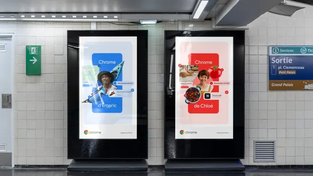
Two large-format digital display posters in a metro station using bold color fields and food imagery to promote the Chrome browser across French and English campaigns.
Summary
Two large-format digital display posters in a metro station using bold color fields and food imagery to promote the Chrome browser in French and English campaigns.
Visual description
A symmetrical composition of two black-framed digital displays mounted on white subway tiles. The left poster features a bright blue field with a portrait of a man, a paint palette, and the text "Chrome d'Emeric." The right uses a warm pink/coral field with photos of strawberries and a woman, labeled "Chrome de Chloé." Both carry the Chrome logo, small attribution text, and French café information at the bottom. The white wall and overhead fluorescent lighting give the scene an institutional, public-transit feel. The posters are high-contrast, bold, and designed to stand out in a crowded space.
Key takeaway
The split-screen color strategy (cool blue vs. warm pink) paired with complementary subject matter (painter vs. chef) creates a sophisticated, memorable campaign that feels accessible and human. The use of bold typographic color fields and real photography in public space advertising shows strong restraint and clarity.
Reuse notes
Excellent reference for transit or public-space campaigns, especially split-identity or multi-audience approaches. Works for tech/SaaS branding that needs to feel warm and approachable. The institutional white-tile setting and overhead framing are useful for retail or service-oriented environments.
More like this


Keep what you find
A free account saves references to boards and can send you a weekly email of picks based on what you save.
To see every result, go Pro.