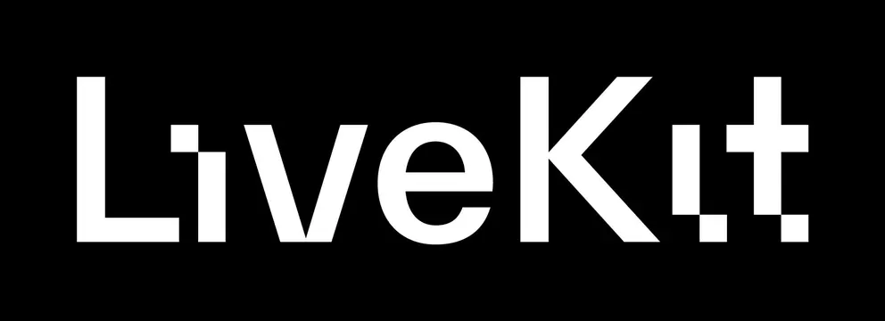
Preview image. Unlock full-res
Bold white sans-serif wordmark on black background, with geometric icon breaks in the letterforms.
Summary
A bold, high-contrast wordmark using geometric sans-serif letters with integrated icon motifs breaking the character spacing.
Visual description
Pure white sans-serif wordmark rendered at large size on a solid black background. The letterforms are heavy and geometric. "LiveKit" is punctuated by a small diamond-shaped accent above the "L" and a cross-plus-sign shape integrating with the "K." The overall effect is clean and technical, with the icon breakpoints lending the wordmark a distinctive, contemporary character. The weight and spacing emphasize geometric precision.
Key takeaway
Integrating tiny icon elements directly into letters (rather than alongside them) creates a unified visual identity where brand and product feel bound together. The high contrast and weight make the wordmark work at any size, and the geometric severity reads as technical/trustworthy.
Reuse notes
Ideal for developer-facing or infrastructure SaaS brands. The geometric breaks work best when there is a genuine product meaning behind them (e.g. connecting systems, modularity). Not suitable for playful or organic brands.
More like this
Keep what you find
A free account saves references to boards and can send you a weekly email of picks based on what you save.
To see every result, go Pro.