Preview image. Unlock full-res
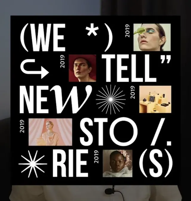
Bold typographic poster using stacked white sans-serif, interlocking image frames, and radiating line elements on black to announce a content initiative.
Summary
Editorial poster announcing a multi-year content initiative with interlocking portrait frames, hand-drawn radiating marks, and fragmented typography arranged on a black background.
Visual description
Black background with white sans-serif typography reading "(WE * TELL NEW STO/RIE (S))" in bold all-caps, arranged diagonally and overlapping across the composition. Five portrait photographs of diverse subjects are embedded in the layout, each labeled with a year (2019, 2019, 2019). A stylized hand-drawn sun/starburst line element appears twice, emphasizing movement and energy. The layout breaks traditional grid alignment, with text and images interlocking and overlapping. The color palette is strictly monochromatic (black, white, and warm-toned photographic skin tones), creating high contrast and graphic intensity. The typography is chunky, geometric, and deliberately fragmented, suggesting partial views or incomplete thoughts.
Key takeaway
Fragment typographic message across the layout to build intrigue and force active reading. Embed photographs as narrative anchors within a bold type-driven design rather than placing them in background or separate zones. Use hand-drawn geometric marks (stars, lines, rays) sparingly to guide eye movement and signal editorial energy without competing with typography or photos.
Reuse notes
Strong for media, editorial, cultural, and content-marketing contexts where you want to announce an ongoing initiative or series. The typographic fragmentation suits complex narratives (multi-year programs, multi-part stories, diverse contributors). Works best on dark backgrounds to isolate photography. The radiating marks can be swapped for other hand-drawn elements (arrows, geometric shapes) but should remain minimal to avoid visual chaos.
More like this

Keep what you find
A free account saves references to boards and can send you a weekly email of picks based on what you save.
To see every result, go Pro.