Preview image. Unlock full-res
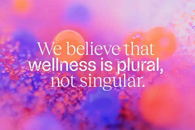
A soft pink-to-purple gradient background with diffused bokeh circles overlaid with white serif quote about wellness plurality.
Summary
A soft pink-to-purple gradient background with diffused bokeh circles overlaid with white serif quote about wellness plurality.
Visual description
An abstract gradient field transitions from magenta and hot pink on the left through lavender and blue in the center to pale pink on the right. Dozens of out-of-focus bokeh orbs in coral, navy, fuchsia, and white float at varying depths, creating atmospheric dimension without sharp geometry. Centered across the composition, large white serif text in three lines reads: "We believe that wellness is plural, not singular." The generous letter spacing and tall line height give the statement room to breathe. The diffused bokeh and soft focus create a dreamlike, meditative visual field that supports the message.
Key takeaway
Bokeh as a layered atmospheric device that feels emotionally warm without requiring photographic content. Serif display type with generous spacing reads as more accessible and reflective than condensed sans-serif. The gradient palette (warm to cool, vibrant but not neon) feels contemporary while supporting wellness/care messaging. Soft focus naturally de-emphasizes edges, inviting introspection.
Reuse notes
Perfect for wellness, mental health, beauty, and lifestyle landing pages or educational overlays. Works as a hero background, a quote card, or a section divider. Scale the type up for large displays or use as a mobile hero. The abstraction is generic enough to pair with specific product or service detail below. Avoid if the context demands sharp product photography or high-contrast data visualization. The softness implies human care over clinical efficiency.
More like this






Keep what you find
A free account saves references to boards and can send you a weekly email of picks based on what you save.
To see every result, go Pro.