Preview image. Unlock full-res
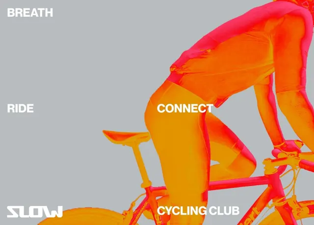
An energetic cycling brand poster layering vibrant orange-to-yellow gradients over a bicycle silhouette against a neutral gray field.
Summary
An energetic cycling brand poster layering vibrant orange-to-yellow gradients over a bicycle silhouette against a neutral gray field.
Visual description
A medium gray background supports a stylized bicycle rendered in gradient fills that transition from deep orange through bright red-orange and yellow-gold. The bike is positioned diagonally, tilted left, creating dynamic diagonal movement. White sans-serif text is scattered across the composition: "BREATH" (upper left), "RIDE" (left, mid-height), "SLOW" (lower left in bolder weight), "CONNECT" (center, overlapping the bike), and "CYCLING CLUB" (bottom right). Text appears in all capitals or lowercase, with varying weights and sizes, creating a playful, organic typographic rhythm. The overall composition balances the energetic gradient bike against a calm background and airy white lettering.
Key takeaway
A gradient-filled subject (the bike) can dominate a composition without overwhelming if the background remains neutral and text is kept light. The diagonal tilt and scattered text placement inject motion and personality into what could otherwise be a static mark. Cycling clubs and sports brands can use warm color gradients and energetic composition to convey action while lowercase or mixed-case text keeps the tone approachable rather than corporate.
Reuse notes
Excellent template for fitness, cycling, and sports community brands. Works best when the gradient subject is visually interesting enough to carry the design. The scattered text layout suits casual, community-focused brands; less effective for formal fitness facilities or luxury wellness. Pair with cycling imagery, team photography, or event promotion.
More like this

Keep what you find
A free account saves references to boards and can send you a weekly email of picks based on what you save.
To see every result, go Pro.