Preview image. Unlock full-res
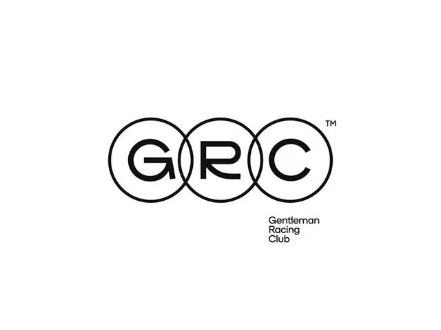
A minimalist emblem of three black circles overlapping horizontally, each containing a single letter (G, R, C), with a registered trademark mark and supporting text label.
Summary
A minimalist emblem of three black circles overlapping horizontally, each containing a single letter (G, R, C), with a registered trademark mark and supporting text label.
Visual description
Three circles of equal diameter are arranged left to right with each overlapping the next at its edge, creating a clean rhythm. Each circle has a thin black outline only and contains a bold sans-serif letter centered within. The letters G, R, and C fill most of the circle interior while maintaining breathing room from the perimeter. A small TM mark sits to the upper right of the rightmost circle. Below the circles, the expanded form "Gentleman Racing Club" appears left-aligned in a compact, modern sans-serif. The entire composition sits centered on a white background, creating a portrait-oriented mark with equal weight between symbol and text.
Key takeaway
The power of repeating geometric units (circles) to create rhythm and unity. The technique of nesting single characters within circles that reads as both modern and timeless. The understated use of outline-only strokes that feel refined and approachable. The balanced placement of text that explains without overwhelming the symbol.
Reuse notes
Ideal for sports clubs, racing teams, heritage brands, and automotive companies seeking an authoritative but accessible identity. The three-circle structure scales well across applications from large signage to small digital favicons. Works across print, embroidery, and digital because of its pure black-and-white execution. The approach suits any organization wanting to suggest prestige, tradition, and precision.
More like this








Keep what you find
A free account saves references to boards and can send you a weekly email of picks based on what you save.
To see every result, go Pro.