Preview image. Unlock full-res
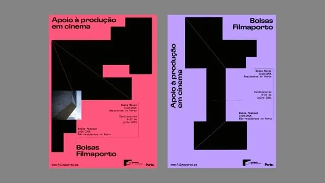
Two Portuguese film festival posters in high-contrast neon pink and lavender with bold geometric cutout shapes and dense sans-serif typography.
Summary
Two bold event posters for Filmaporto using neon pink and lavender as primary colors, with black geometric cutout shapes and dense all-caps sans-serif typography describing film industry services.
Visual description
A side-by-side pair of nearly identical poster templates. Left: hot neon pink background with a large black geometric shape (abstract, jagged outline) overlaid. Right: soft lavender background with a corresponding black shape. Both feature white all-caps sans-serif text describing services (support for film production, scholarship for films, resources for film festivals). Diagonal line patterns cut through the black shapes as visual texture. Small footer with branding, website, and logo in consistent typeface and scale. The composition uses the stark black-and-pastel contrast to create dynamism, with the geometric cutouts feeling directional and modern.
Key takeaway
The bold two-color system (one hot, one cool) applied symmetrically across paired designs creates visual unity and emphasis. The geometric black shapes act as both visual interest and framing devices. Dense typography in bold sans-serif reads well at a distance despite complexity.
Reuse notes
Strong for event marketing, film festivals, or cultural institutions needing contemporary poster language. The high contrast works well for print and digital. Pairs well with minimal color palettes elsewhere on a site (the posters themselves are visually loud). Best in contexts where energy and professionalism are both required.
More like this

Keep what you find
A free account saves references to boards and can send you a weekly email of picks based on what you save.
To see every result, go Pro.