Preview image. Unlock full-res
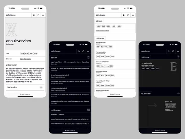
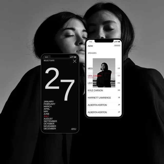
A collection of mobile UI screens showcasing a gallery website design in both light and dark modes, featuring artist information and exhibition lists.
Summary
A collection of mobile UI screens showcasing a gallery website design in both light and dark modes, featuring artist information and exhibition lists.
Visual description
The design uses a strict monochrome palette with high-contrast black and white screens. It features a grid-based layout with large serif typography for headings and clean sans-serif for body text. The composition relies on generous whitespace and thin dividers to organize content.
Key takeaway
Use a strong typographic hierarchy and a strict monochrome palette to create a sophisticated, editorial feel for content-heavy mobile interfaces.
Reuse notes
Reach for this layout when designing portfolio or cultural institution websites that need to prioritize text and imagery without visual clutter.
More like this
Keep what you find
A free account saves references to boards and can send you a weekly email of picks based on what you save.
To see every result, go Pro.