Preview image. Unlock full-res
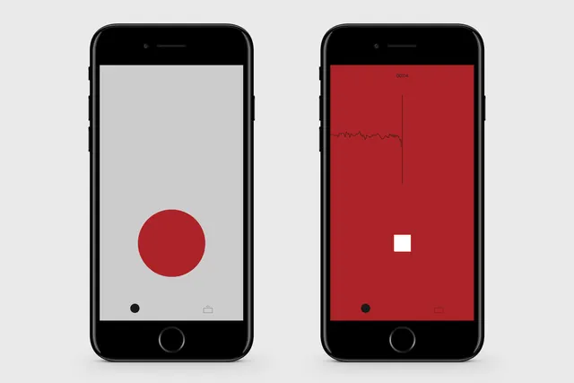
A side-by-side comparison of two mobile app screens featuring minimalist geometric shapes and high-contrast color schemes.
Summary
A side-by-side comparison of two mobile app screens featuring minimalist geometric shapes and high-contrast color schemes.
Visual description
Two smartphone mockups display contrasting UI designs: one with a red circle on a white background and one with a white square on a red background. The designs utilize simple geometric shapes and a primary red and white color palette.
Key takeaway
The design demonstrates how simple geometric elements and high-contrast colors can create a bold, clean user interface.
Reuse notes
Can be used as a reference for minimalist app branding and high-contrast UI layouts.
More like this

Keep what you find
A free account saves references to boards and can send you a weekly email of picks based on what you save.
To see every result, go Pro.