Preview image. Unlock full-res
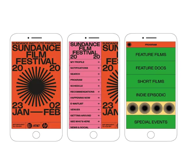
Mobile app screens for Sundance Film Festival using bold, high-contrast color blocking and geometric sunburst icons to organize event information.
Summary
Mobile app screens for Sundance Film Festival using bold, high-contrast color blocking and geometric sunburst icons to organize event information.
Visual description
Three vertically stacked mobile phone mockups display the app's interface. The leftmost screen features a large radiating sunburst graphic in solid black centered on a bright orange background, with bold all-caps "SUNDANCE FILM FESTIVAL 2020" and "23 JAN - FEB" in white sans-serif at top and bottom. The middle screen uses a bright pink/magenta background with a white navigation menu listing items like "MY PROFILE", "NOTIFICATIONS", "PROGRAM", "SCHEDULE", plus a smaller sunburst graphic and date "23 JAN 2020" in the lower corner. The right screen shifts to bright kelly green with white text menu options ("PROGRAM", "FEATURE FILMS", "FEATURE DOCS", "SHORT FILMS", "INDIE EPISODIC", "SPECIAL EVENTS") and a row of three small black sunburst icons as a visual divider. Bold condensed sans-serif type in all-caps anchors the hierarchy across all three screens.
Key takeaway
The radiating sunburst as a recognizable, repeatable icon that ties together visual identity. The disciplined use of one dominant color per screen to drive clear information hierarchy and distinct navigation sections. The balance of bold geometric graphics with utilitarian sans-serif typography for an energetic but readable interface.
Reuse notes
Strong for any event app, festival guide, or media app requiring high-impact visual organization. The all-caps, high-contrast approach works well when commanding attention and segmenting distinct content sections. The sunburst pattern is iconic and memorable, making it suitable for branded applications across web and mobile.
More like this


Keep what you find
A free account saves references to boards and can send you a weekly email of picks based on what you save.
To see every result, go Pro.