Preview image. Unlock full-res
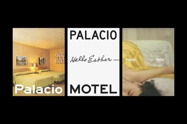
Three-panel photographic composition contrasting warm hotel interiors and brand identity with script and sans-serif typography.
Summary
A hotel branding system presenting three distinct visual narratives: a warm cream-toned interior room, a centered word mark with handwritten name, and a soft landscape view, unified by minimalist layout and warm beige-to-gold palette.
Visual description
Horizontal three-panel composition against black background. Left panel shows an interior room with pale yellow walls, warm incandescent lighting, and minimal furnishings. Center panel is clean white with "PALACIO" in bold sans-serif above a handwritten script signature reading "Nella Esther" and word "MOTEL" below in sans-serif. Right panel features a soft-focus landscape with peachy-gold tones and layered atmospheric depth. All panels are rectangular, evenly spaced, and contained with soft neutral borders that emphasize the clean, gallery-like presentation.
Key takeaway
The three-panel comparison method to show brand touchpoints and mood simultaneously. The pairing of handwritten script (personal, luxe) with clean sans-serif (professional, accessible) for the same entity. The warm monochromatic palette (cream, gold, beige) used across photography to unify disparate image types.
Reuse notes
Effective for hospitality identity, boutique lodging, or luxury real-estate branding that needs to convey both tangible spaces and intangible quality. Works well when the brand identity spans interior design and destination marketing. Handwritten script reads premium and personal; balance it with clear sans-serif for legibility and accessibility.
More like this
Keep what you find
A free account saves references to boards and can send you a weekly email of picks based on what you save.
To see every result, go Pro.