Preview image. Unlock full-res
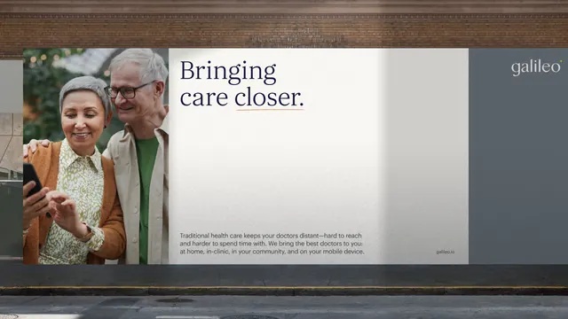
A split-screen layout pairing a warm, soft-focus photograph of two older adults on the left against a brick texture, with clean gray-white text space on the right declaring the brand mission.
Summary
A split-screen composition with a warm, soft-focus photograph of two older adults on the left, paired against a clean gray-and-white text panel on the right displaying a mission statement in serif display type.
Visual description
Left side: a warm-toned, soft-focus photograph of an older woman and man, both smiling, shot close enough to see intimacy and care in their expressions. A textured brick wall is visible in the background. Right side: a dark gray rectangular panel with the Galileo wordmark positioned upper-right in a minimal sans-serif, and a large serif headline "Bringing care closer." centered in the middle, followed by smaller body text describing healthcare services. The photograph bleeds to the edge while the text panel sits cleanly inset. A narrow vertical line in olive-green or gold acts as a subtle divider. The color palette moves from warm photograph (creams, soft greens in clothing) to cool professional gray and white, creating a sense of both human connection and clinical trust.
Key takeaway
The asymmetry of a full-bleed photograph against a bounded, white-space-heavy text panel. The use of a serif headline (conveying tradition and care) against sans-serif branding and body copy. The subtle warmth in the photograph contrasting with the cool, professional gray of the type panel, which visually separates emotion from practicality.
Reuse notes
Strong for healthcare, insurance, and wellness brands where you need to balance human warmth and approachability with institutional trust and credibility. The soft-focus portrait creates emotional connection while the clean type panel ensures professionalism and readability. The layout pairs well with minimal copy or a single, clear call-to-action.
More like this



Keep what you find
A free account saves references to boards and can send you a weekly email of picks based on what you save.
To see every result, go Pro.