Preview image. Unlock full-res
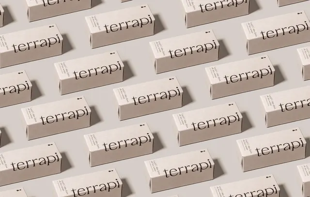
A repetitive pattern of small rectangular boxes featuring the wordmark 'terrapi' in a minimalist layout.
Summary
A repetitive pattern of small rectangular boxes featuring the wordmark 'terrapi' in a minimalist layout.
Visual description
Multiple small, light-colored rectangular boxes are arranged in a diagonal grid pattern. Each box features the lowercase wordmark 'terrapi' in a black sans-serif typeface. The composition uses soft, natural lighting creating subtle shadows on a neutral background.
Key takeaway
Use repetitive product placement in a grid to create a rhythmic and cohesive brand pattern.
Reuse notes
Ideal for creating brand patterns for social media backgrounds or website hero sections.
More like this




Keep what you find
A free account saves references to boards and can send you a weekly email of picks based on what you save.
To see every result, go Pro.