Preview image. Unlock full-res
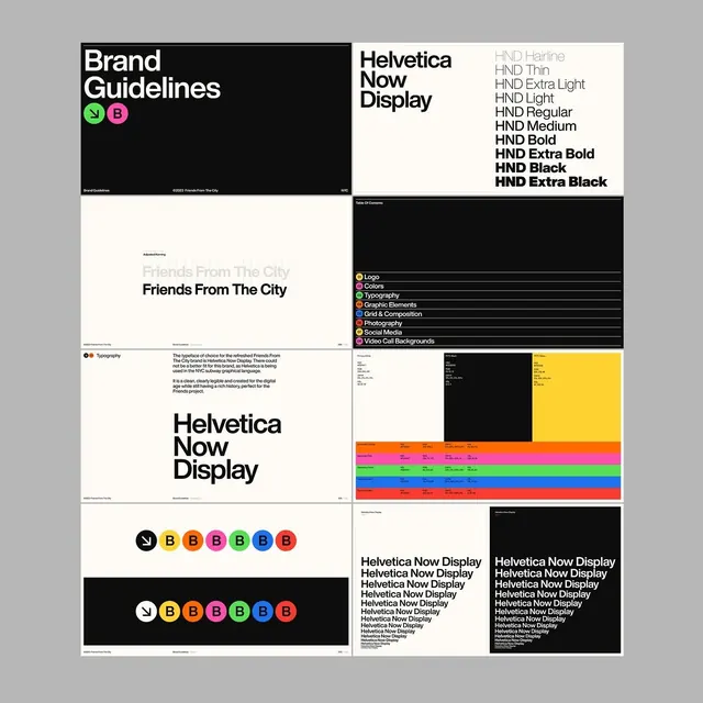
A multi-panel brand guidelines poster for Friends From The City showing typography specimens, color swatches, logo variations, and design system documentation in black, white, and vibrant color blocks.
Summary
A multi-panel brand guidelines document for Friends From The City, showcasing typography (Helvetica Now Display), color palette system, logo lockups, and design rules in a clean, modular layout.
Visual description
The poster is divided into six panels on a light gray background. Top left: black panel with white "Brand Guidelines" heading and two bright circular brand marks (lime green and hot pink). Top right: cream panel listing Helvetica Now Display weight variants (Hairline through Extra Black) in a hierarchical display. Left-center: cream panel showing the display typeface at large scale with supporting copy about typography selection. Right-center: black panel with a numbered Table of Contents (Logo, Colors, Typography, Graphic Elements, Grid & Composition, Photography, Social Media, Video Call Backgrounds) using the same colored badge system. Bottom left: demonstration of seven circular logo variations in different color combinations (green, yellow, red, pink, teal, blue, coral) stacked vertically. Bottom right: two black cards with repeated "Helvetica Now Display" text in different sizes to show hierarchy and scaling rules.
Key takeaway
The badge-and-number system (colored circles with letters) as a visual shorthand for category indexing. The split black-and-cream panel layout that separates didactic content from specimen display. The large-scale typography showcase paired with condensed rules-text underneath.
Reuse notes
Strong template for documenting a brand system or design-kit guide. Works well when type is the star (here, Helvetica Now) and color palette is compact enough to fit in one swatch row. The modular panel structure scales to 4-8 sections without feeling cramped.
More like this







Keep what you find
A free account saves references to boards and can send you a weekly email of picks based on what you save.
To see every result, go Pro.