Preview image. Unlock full-res
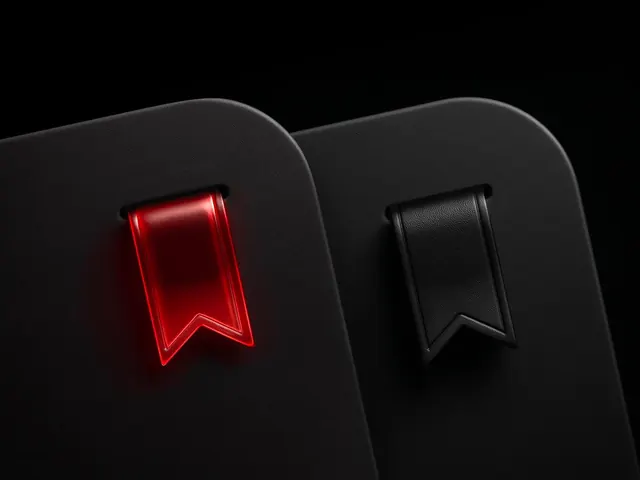
A side-by-side comparison of two ribbon-style icons, one in glowing red and one in matte black, presented on dark rounded cards.
Summary
A side-by-side comparison of two ribbon-style icons, one in glowing red and one in matte black, presented on dark rounded cards.
Visual description
Two stylized ribbon icons are displayed on separate dark grey rounded rectangular cards against a black background. The left ribbon features a vibrant red glow effect, while the right ribbon is a flat matte black.
Key takeaway
The design demonstrates how a single icon shape can be adapted for different visual weights and states, such as active/alert versus inactive/neutral.
Reuse notes
This layout can be used to showcase UI components, badge variations, or award icons in a portfolio.
More like this






Keep what you find
A free account saves references to boards and can send you a weekly email of picks based on what you save.
To see every result, go Pro.