Preview image. Unlock full-res
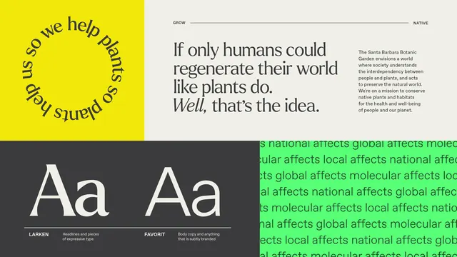
Environmental branding system showing serif/sans-serif pairing split across high-contrast yellow and dark sections with lime-green accent text.
Summary
Type specimen for an environmental NGO showing serif headlines and sans-serif body across a split yellow/dark layout with lime-green accent callouts and sustainability messaging.
Visual description
A modular type specimen divided into quadrants. Top left features a bright yellow background with a curved serif headline and serif body copy in black. Top right shows dark gray/black background with the same serif treatment and body copy. Below, two dark sections display large sans-serif letter forms (Aa pairing) labeled Larken and Faiford, each with descriptive text. Throughout the composition, lime-green text blocks interrupt the layout describing the brand's environmental values (regeneration, plants, world). The color strategy creates visual hierarchy through stark contrast between warm yellow, cool black, and energetic lime green. Typography emphasizes the pairing of a refined serif for headlines with a clean sans-serif for accessibility and modern readability.
Key takeaway
The split-background approach to showcase typography in two distinct moods within one system. The lime-green accent as a marker of the brand's environmental mission, breaking up monochrome tension. The clear modular grid that makes type pairing legible at a glance.
Reuse notes
Works well for sustainability, nonprofit, or educational brands needing to establish type hierarchy and environmental credibility. The high contrast reads well at small sizes and in reproduction. The lime accent can feel dated if overused; reserve it for accent moments only.
More like this




Keep what you find
A free account saves references to boards and can send you a weekly email of picks based on what you save.
To see every result, go Pro.