Preview image. Unlock full-res
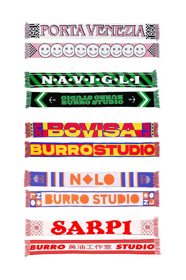
Stacked collection of candy-striped graphic ribbons, each bearing studio or brand names in bold, uppercase sans-serif across contrasting color blocks.
Summary
A playful collection of vertically stacked candy-striped graphic banners, each featuring a studio or brand name (Porta Venezia, Navigli, Bomisa, Sarpi, etc.) in bold uppercase sans-serif, separated by checkerboard, smiley-face, and directional chevron patterns.
Visual description
Nine horizontal ribbon banners arranged in a vertical stack, each 1-2 inches tall with pinked or scalloped edges suggesting cut fabric. Each ribbon features: checkerboard or gingham borders on the left and right edges in pink, green, or warm tones; centered display-weight sans-serif text in all-caps; and a solid or patterned background color block (magenta, green, orange, red, or blue). Some ribbons include decorative elements (smiley faces, navigational arrows, pattern fills). Colors shift warm to cool: pinks and reds dominate the top half, greens and blues the bottom. No image or photography; pure graphic typography and pattern.
Key takeaway
The use of checkerboard and scalloped-edge borders as a consistent framing device; the constrast of oversized all-caps sans-serif against bright, restricted color palettes; the vertical rhythm created by repeating a simple 2-color structure with minor variations in pattern and proportion.
Reuse notes
Strong for retro studio or event branding, particularly in creative industries (design, film, music, galleries). Works well in print (packaging, signage, event collateral). The playful, handmade stripe aesthetic reads as approachable despite bold color, so it suits friendly or community-focused brands. Avoid on formal corporate or minimal-aesthetic projects.