Preview image. Unlock full-res
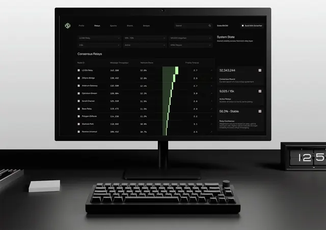
Technical monitoring dashboard with dark theme, organized data tables, live metrics, and accent green status indicators for network relay health.
Summary
A dark-mode network relay monitoring dashboard showing tabular metrics for consensus relays with real-time status, throughput data, and critical system metrics displayed across a two-monitor workspace setup.
Visual description
A wide desktop workspace mockup shows two monitors displaying a dark-theme technical interface. The left monitor houses a navigation bar with tabs (Profile, Relays, Epochs, Shards, Bridges) and a data table listing relay nodes with columns for Node ID, Message Throughput, Network Share, and Finality Time. Each row pairs a relay name with precise numeric metrics. The right monitor shows a "System State" summary panel with key KPIs in large white type (32,343,244) and supplementary panels below describing consensus state and stability metrics. An accent bright green vertical bar chart visualizes network participation rates. The entire interface uses a near-black background with white and light-gray text, creating stark legibility for the dense data. All UI elements are aligned to a crisp grid, and typography is a clean sans-serif or monospace family emphasizing precision.
Key takeaway
The disciplined use of a single bright accent color (electric green) for data visualization and status indicators against a monochromatic background, which draws the eye without visual clutter. The two-column layout strategy: data table on the left for browsing, summary metrics on the right for at-a-glance KPIs. The merciless prioritization of information hierarchy via typography size and positioning rather than color variety or visual embellishment.
Reuse notes
Essential reference for cryptocurrency network dashboards, DevOps monitoring tools, infrastructure management UIs, and any application handling large datasets where precision and scanability are critical. The green accent reads as "active" or "positive" in network contexts but is not universal, so adjust the accent color if it conflicts with your domain's conventions (red for alerts, blue for secondary data). Works best on large displays and with monospaced type for numeric columns. Not suitable for consumer-facing interfaces where the severity and density would feel oppressive.
More like this


Keep what you find
A free account saves references to boards and can send you a weekly email of picks based on what you save.
To see every result, go Pro.