Preview image. Unlock full-res
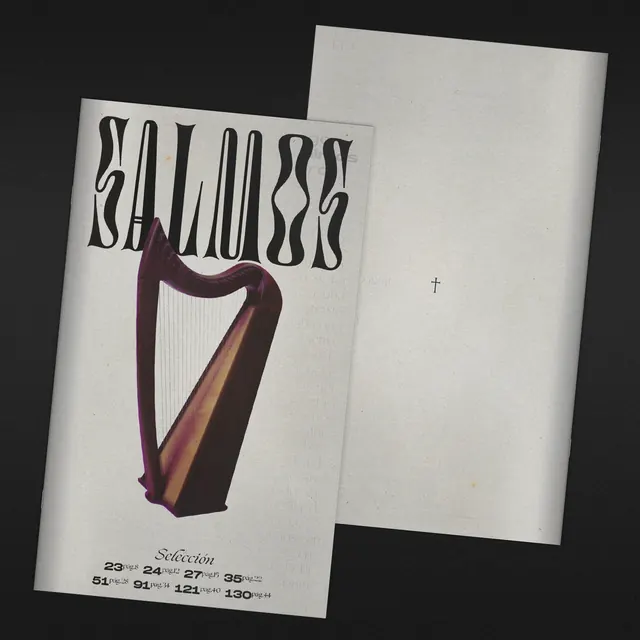
A booklet cover titled 'Salmos' set in a warped custom display face, centered on a photograph of a harp, shown alongside its plain back cover with a single small cross.
Summary
A small printed booklet titled "Salmos" (Psalms) uses a custom warped display typeface across the top of its cover, centered above a straight photograph of a wooden harp, with a plain back cover carrying only a tiny cross mark.
Visual description
Two booklets are shown overlapping at an angle against a black background, both on textured off-white paper. The front cover of the top booklet reads "Salmos" in a bold custom lettering style where each letterform bulges and tapers unevenly, giving the word a hand-carved, slightly gothic feel. Below the title, a photograph of a dark wooden harp with visible strings sits centered on the page, its warm brown and burgundy tones the only saturated color in an otherwise desaturated composition. At the bottom, italic script reads "Selección" followed by a grid of page numbers with small "pág." references (23, 24, 27, 35, 51, 91, 121, 130). The second booklet, shown behind and to the right, is a plain light gray page with a single small cross symbol centered in its middle, otherwise empty.
Key takeaway
A single custom display typeface with organic, uneven letterforms can carry an entire cover's personality on its own, needing only one supporting photograph to complete the composition. Leaving a full page nearly empty except for one small symbol is a confident, restrained way to signal a chapter break or interstitial page.
Reuse notes
Reference for religious, literary, or music-related print publications wanting a handcrafted, editorial feel rather than a corporate one. The warped custom lettering treatment works well for titles that want to feel timeless or liturgical; the index-style page listing at the bottom is a reusable device for booklet or hymnal covers.
More like this




Keep what you find
A free account saves references to boards and can send you a weekly email of picks based on what you save.
To see every result, go Pro.