Preview image. Unlock full-res
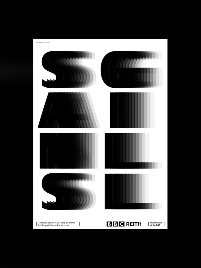
A poster for Spin Studio's BBC Reith Sans typeface launch shows letterforms as motion-trail echoes fading from solid black to white, marking the retirement of Gill Sans.
Summary
A promotional poster by design studio Spin for the BBC's new Reith Sans typeface arranges eight oversized letterforms in a two-column grid, each rendered as a stack of repeated, fading silhouettes that suggest a letter dissolving or stepping away.
Visual description
White poster on a black background, small caption text at the top left reading "BBC Reith Sans Cd Bold." Below it, eight large letterforms are arranged in a two-column, four-row grid. Each letter is built from many overlapping, evenly offset copies of itself in a gradient from solid black to pale gray, creating a stepped motion-blur or echo effect, as though each letter is fading or sliding out of frame. At the bottom, a caption reads "The Gexit. No more Gill Sans. So thanks for the good times. And au revoir." next to the "BBC REITH" logo lockup and the tagline "The new face of the BBC."
Key takeaway
Repeating a single letterform at incrementally shifted positions with a fading tone creates a strong sense of motion and transition without any literal illustration, a fitting device for a poster about retiring one typeface in favor of another. Wry, specific copy ("The Gexit") gives an otherwise formal type-specimen poster a distinct editorial voice.
Reuse notes
Strong reference for type-specimen posters, rebrand announcements, or "before and after" identity campaigns. The stepped-echo letterform treatment is a reusable device for visualizing change, transition, or motion in a purely typographic composition.
More like this

Keep what you find
A free account saves references to boards and can send you a weekly email of picks based on what you save.
To see every result, go Pro.