Preview image. Unlock full-res
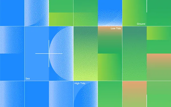
Abstract grid visualization mapping tidal zones and water depth using gradient-filled blocks and labels, combining blues and greens with tan accents.
Summary
Abstract grid visualization representing tidal zones and water depth, composed of gradient-filled rectangular blocks in blue-green palette with sparse text labels.
Visual description
A rectangular grid subdivided into approximately 20 colored blocks, each filled with smooth gradients. Deep blue blocks dominate the left and lower portion, representing deeper water or the "Sea" zone; they blend into lighter teal and cyan. Bright lime and grass green blocks occupy the upper right, labeled "Ground." Tan and muted coral blocks appear in scattered cells, labeled "Low Tide" and "High Tide," marking transition zones. Thin white dividing lines separate the grid cells. Soft gradient transitions within each cell suggest fluid depth or elevation change rather than sharp boundaries. The overall effect is cartographic and calm, suggestive of a tide pool or shallow-water terrain map rendered in a minimalist, data-driven style.
Key takeaway
The gradient-filled block approach creates visual continuity and sophistication beyond flat color. Mixing solid fills with smooth gradients suggests depth and temporal change (tidal flow, water movement) without literal representation. Strategic label placement guides interpretation without cluttering the composition. Cool-to-warm color shifts (blue to green to tan) communicate both spatial relationships and environmental zones intuitively.
Reuse notes
Effective template for scientific, environmental, or geospatial visualization. The approach works for climate, hydrology, or ecological data. Can be adapted for UI backgrounds or abstract pattern libraries. Gradient-block compositions suit dashboards and editorial layouts. Ensure labels are legible at display scale; sparse labeling maintains elegance but may require a legend in data-heavy contexts.
More like this








Keep what you find
A free account saves references to boards and can send you a weekly email of picks based on what you save.
To see every result, go Pro.