Preview image. Unlock full-res
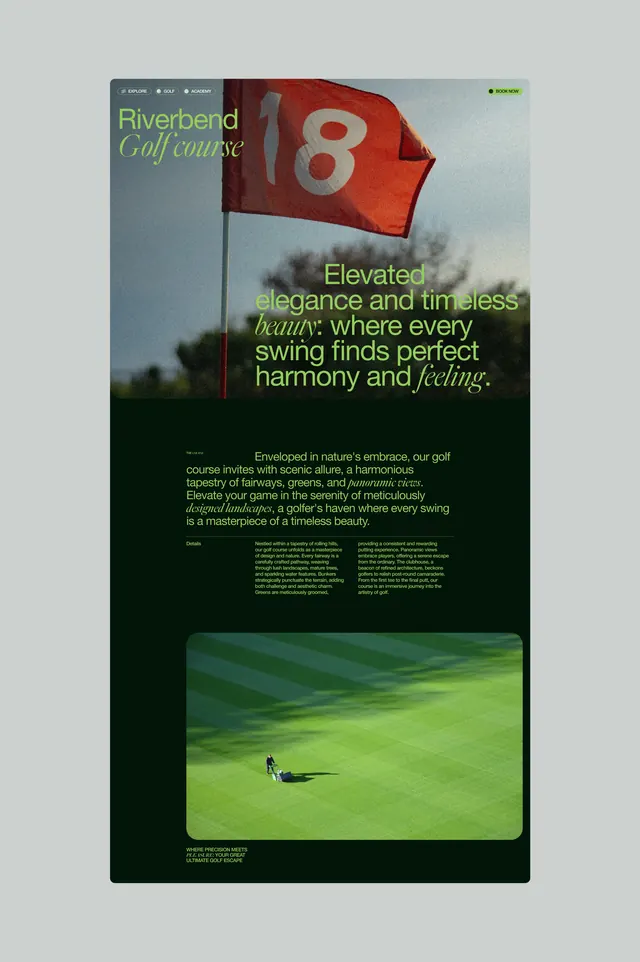
A golf-course brand website hero pairing a full-bleed photo of a red flag numbered 18 with an oversized lime-green headline, followed by a dark editorial section and a lawn-mowing photo.
Summary
A golf-course brand website hero pairing a full-bleed photo of a red flag numbered 18 with an oversized lime-green headline, followed by a dark editorial section and a lawn-mowing photo.
Visual description
The top of the page is a tall photo of a red flag marked "18" waving against a pale sky, with a small pill-shaped nav bar (Explore, Golf, Academy, Book Now) overlaid at the top. A wordmark reading "Riverbend" in sans-serif sits above "Golf course" set in a green italic serif script. To the right, a lime-green oversized sans-serif headline mixes upright and italic serif words for emphasis ("elegance," "beauty," "feeling"). Below the photo, the page shifts to a near-black background with the same lime-green type used for a two-column body paragraph and a small label. A rounded-corner photo further down shows an aerial view of a groundskeeper mowing striped green fairway turf, with a caption underneath.
Key takeaway
Mixing an italic serif for a few emphasized words inside an otherwise sans-serif headline, combined with a single accent color (lime-green) that recurs against both light photography and a black section, keeps a photo-heavy hero feeling designed rather than just decorative.
Reuse notes
A strong reference for hospitality, golf, or outdoor-leisure brand sites that want a premium but not overly corporate feel. The mixed-weight, mixed-style headline treatment could translate to travel or private-club landing pages; pairs well with muted greens and large documentary-style photography.
More like this




Keep what you find
A free account saves references to boards and can send you a weekly email of picks based on what you save.
To see every result, go Pro.