Preview image. Unlock full-res
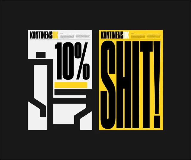
A graphic design study featuring two layouts that explore the interplay between bold typography, geometric shapes, and high-contrast color blocking.
Summary
A graphic design study featuring two layouts that explore the interplay between bold typography, geometric shapes, and high-contrast color blocking.
Visual description
The image shows two side-by-side compositions. The left features a '10%' graphic integrated into a white and yellow geometric frame, while the right features the word 'SHIT!' in large, bold, yellow and white block letters.
Key takeaway
The design demonstrates how heavy, condensed typography can be used as a structural element to create a powerful visual impact.
Reuse notes
These layouts can be used as inspiration for bold editorial headers, posters, or high-impact social media graphics.