Preview image. Unlock full-res
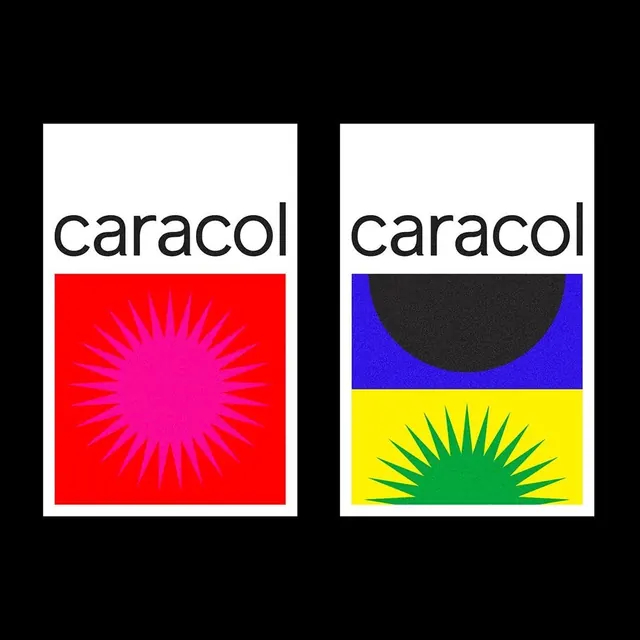
A side-by-side comparison of two logo designs for 'caracol', featuring different color schemes and graphic elements.

Summary
A side-by-side comparison of two logo designs for 'caracol', featuring different color schemes and graphic elements.
Visual description
Two rectangular logo blocks are shown side-by-side. The left version features a red background with a pink sunburst icon, while the right version features a blue and yellow background with a black semi-circle and a green sunburst icon.
Key takeaway
The design demonstrates how different color palettes and graphic symbols can alter the visual identity of the same wordmark.
Reuse notes
These designs can be used as inspiration for brand identity systems and color theory exploration.
More like this

Keep what you find
A free account saves references to boards and can send you a weekly email of picks based on what you save.
To see every result, go Pro.