Preview image. Unlock full-res
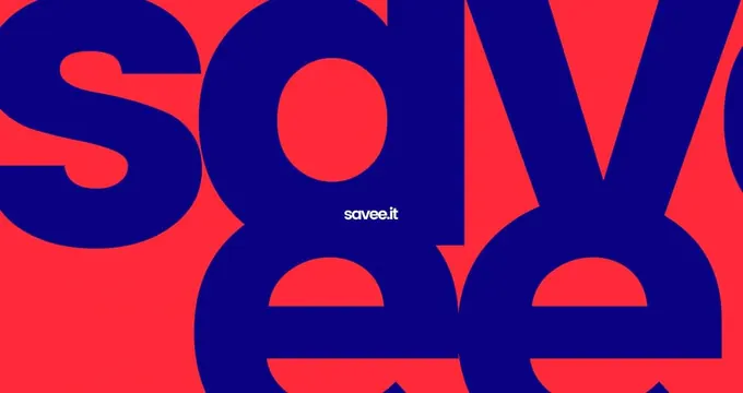
A tight, oversized lowercase wordmark set in bold red and navy letterforms that overlap and crop off the frame edges, with a small white sub-lockup centered in one letter's counter.
Summary
A tight, oversized lowercase wordmark set in bold red and navy letterforms that overlap and crop off the frame edges, with a small white sub-lockup centered in one letter's counter.
Visual description
Thick, rounded lowercase letters fill the entire frame, scaled so large that the first and last characters bleed off both edges. The letters alternate between a solid navy fill on a red ground and a red fill on navy, so the color relationship inverts letter to letter. Inside the open counter of one letter, a small white sans-serif sub-lockup sits centered at a much smaller scale, acting like a tagline or domain-style signature nested inside the main mark.
Key takeaway
Cropping oversized type at the frame edges and inverting the figure-ground color relationship letter by letter creates a graphic, poster-like wordmark that reads as texture from a distance and as type up close.
Reuse notes
A strong reference for confident, high-energy brand identity work: social avatars, poster headers, or app splash screens where a wordmark needs to dominate the frame. The nested small-scale sub-lockup trick is useful whenever a mark needs a secondary line (tagline, URL) without competing for attention.
More like this


Keep what you find
A free account saves references to boards and can send you a weekly email of picks based on what you save.
To see every result, go Pro.