Preview image. Unlock full-res
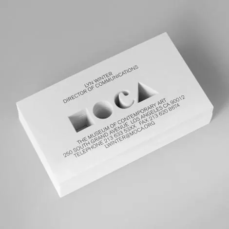
A stack of white business cards for a museum of contemporary art, featuring a deboss-only logotype made of four simple geometric shapes standing in for the letters.
Summary
A stack of white business cards for a museum of contemporary art, featuring a deboss-only logotype made of four simple geometric shapes standing in for the letters.
Visual description
A neat stack of plain white cards is photographed at a slight angle on a light gray backdrop. The top card shows a name and title in small tracked-out sans-serif caps in the upper area, then a four-character logotype rendered entirely as blind embossing (a square, a circle, a diamond, and an arch, no ink, just raised paper), followed by the institution's full name, address, phone and fax numbers, and an email address in the same small caps below.
Key takeaway
Building a logotype out of pure geometric shapes and printing it as an uninked deboss rather than a flat mark lets the card's material and light do the branding work, no color or ink needed at all.
Reuse notes
A useful reference for museum, gallery, or cultural-institution stationery wanting a restrained, tactile identity. The shapes-as-letters idea and the deboss-only execution both translate well to any brand that wants its print collateral to feel crafted rather than printed.
More like this



Keep what you find
A free account saves references to boards and can send you a weekly email of picks based on what you save.
To see every result, go Pro.