Preview image. Unlock full-res
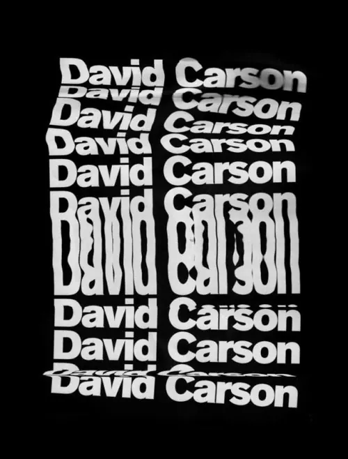
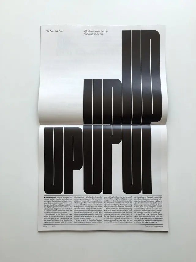
A typographic exploration of the name 'David Carson' featuring various weights, sizes, and orientations of a bold sans-serif typeface.
Summary
A typographic exploration of the name 'David Carson' featuring various weights, sizes, and orientations of a bold sans-serif typeface.
Visual description
The image displays the name 'David Carson' repeated in a dense, stacked grid. The text varies in scale, with one large central instance and several smaller surrounding instances in different weights.
Key takeaway
The design demonstrates how varying typographic scale and weight can create a dynamic, high-impact visual rhythm.
Reuse notes
This can be used as inspiration for experimental branding, editorial headers, or typographic posters.
More like this


Keep what you find
A free account saves references to boards and can send you a weekly email of picks based on what you save.
To see every result, go Pro.