Preview image. Unlock full-res
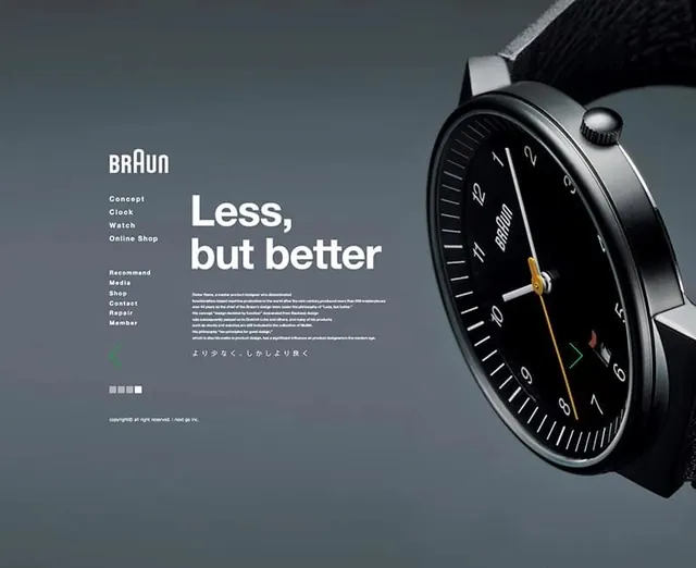
A minimalist advertisement featuring a Braun watch with a focus on the 'Less, but better' philosophy.
Styleminimal, swiss, corporate-clean, luxury, dark-mode
Colordark, high-contrast, monochrome
Typesans-serif, all-caps
Moodprofessional, elegant, premium, calm
Tagswatch, minimalism, advertising, product-shot, typography
Palette
#555E66
#07080A
#D2D4D6
Summary
A minimalist advertisement featuring a Braun watch with a focus on the 'Less, but better' philosophy.
Visual description
The image features a high-quality photograph of a black Braun watch on the right side against a dark grey background. On the left, white text displays the brand name, product features, and the slogan 'Less, but better' in a clean, minimalist layout.
Key takeaway
The design uses ample negative space and high-contrast typography to emphasize product quality and minimalist aesthetics.
Reuse notes
This layout can be reused for high-end product marketing that prioritizes clean aesthetics and clear value propositions.