Preview image. Unlock full-res
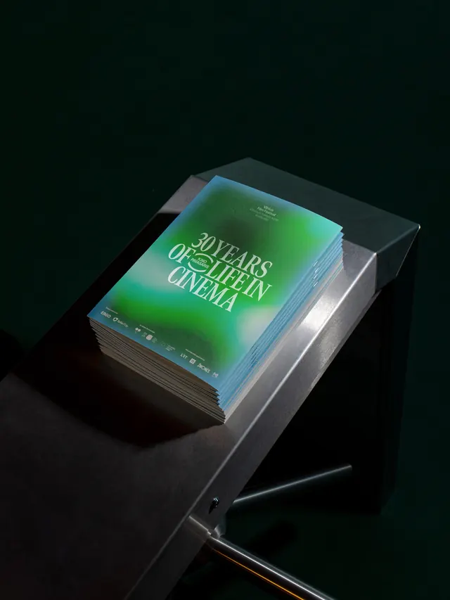
A stack of printed film-festival program booklets photographed on a metal stand, their covers washed in a glowing blue-to-green holographic gradient behind a bold anniversary headline.
Summary
A stack of printed film-festival program booklets photographed on a metal stand, their covers washed in a glowing blue-to-green holographic gradient behind a bold anniversary headline.
Visual description
A neat stack of saddle-stitched booklets rests at an angle on a brushed-metal fixture (resembling a turnstile or ticket-gate arm), shot against a near-black background so the covers appear to float in shadow. The top cover carries a soft, cloud-like gradient moving from teal-blue at the top corner into deep green at the bottom, with a bold serif headline reading an anniversary tagline ("30 years of life in cinema") stacked in three lines of white type, overlapping a small circular festival badge. Small print at the bottom edge lists a row of sponsor and partner logos and festival dates in tiny sans-serif type.
Key takeaway
Using a soft holographic gradient as the entire cover background, rather than a photograph or illustration, lets a single bold serif headline and a small badge carry all the visual weight while still feeling premium and current.
Reuse notes
A strong reference for cultural-event branding: film festivals, anniversaries, or arts programs wanting a cover treatment that feels contemporary without being loud. The gradient-plus-serif-headline pairing and the practice of photographing print collateral in situ (here, on event signage) both transfer well to other print-heavy brand launches.
More like this
Keep what you find
A free account saves references to boards and can send you a weekly email of picks based on what you save.
To see every result, go Pro.